Accessible colours for your design system: A comprehensive guide
In the dynamic realm of design systems, a robust and accessible colour palette stands as a pivotal cornerstone that profoundly shapes a product’s identity and user experience.
Within the following article, I venture into the intricate process of auditing and transforming a Design System’s colour palette, a journey that seeks to marry the qualities of harmony, accessibility, and consistency. This journey not only entailed rigorous testing but also embraced the utilisation of instrumental tools to forge a palette that seamlessly marries aesthetics with inclusivity.
1. Assessing your starting point
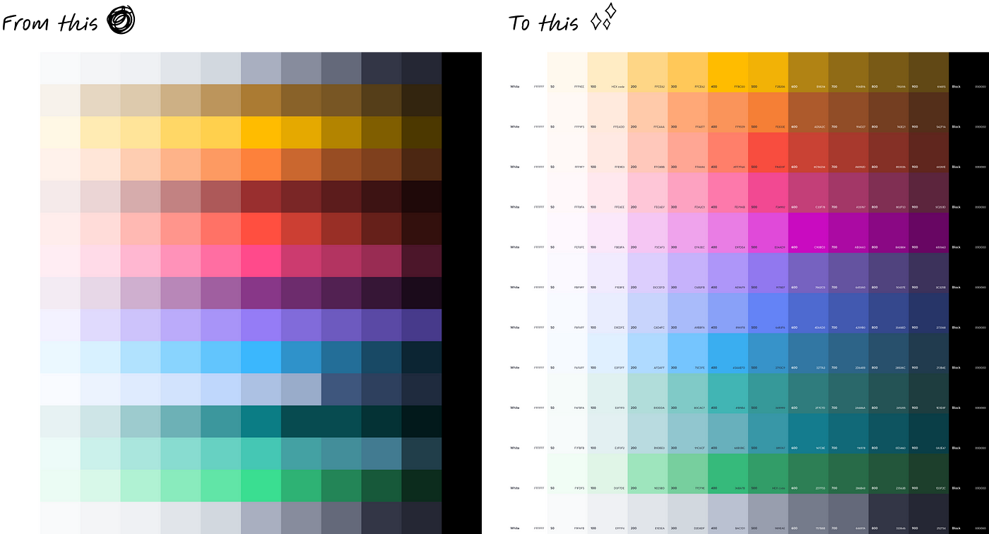
If you are starting from an already existing colour palette or design system, your journey might start by assembling all the existing colours and shades. I started there myself and very early on it became evident that this palette looked like a patchwork assembly, sorely lacking in harmony and adherence to accessibility standards. Thus, the imperative to rethink the palette emerged, aligning it with up-to-date accessibility standards.
Regardless if there is an existing palette or not, the initial phase might also involve identifying non-negotiable colours that anchor your product’s or design system’s visual identity and functional attributes. This is also a good time to identify stakeholders that would need to be involved in either identifying these non-negotiables or approve any changes to the existing colour palette (such as Marketing teams, other designers and product managers, and front-end devs working closely with the design system). In my case, this encompassed:
- Branding colours: Beyond mere visual aesthetics, these colours establish a connection with the brand. Their incorporation sustains brand consistency while instilling users with the core values that the company stands upon.
- Semantic colours: Functionally indispensable, semantic colours illuminate crucial information, error handling, and form validation. Adhering to accessibility guidelines, especially in this colour category, is crucial for an inclusive interface.
- Industry or context-specific colours: If your design system caters to tools that operate within a broad spectrum of statuses, relying on colour combinations to signify these statuses can play a pivotal role in conveying the urgency of actions. Adhering to not only to accessibility guidelines but also to industry standards can be pivotal for an inclusive and familiar interface.

2. Leveraging the right tools
Navigating the intricacies of constructing a coherent palette — departing from a few non-negotiable colours — led me to seek help in different open source tools. An example of this was the Accessible Palette from Wildbit Labs. This tool allowed the input of baseline colours (for example the company’s brand colours) which in turn generated a spectrum of accessible colour variations.

This streamlined the process of finding accessible colours that work harmoniously with each other and minimise trial and error. Accessible Palette from Wildbit Labs is just one example of existing tools that proved invaluable during my process.
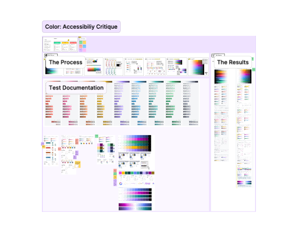
3. Harmonising palette and components
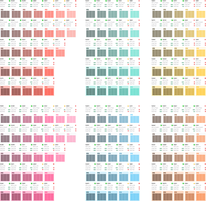
Validating colours produced by Accessible Palette from Wildbit Labs involved harnessing different tools like the Able — Friction Free Figma plugin or the EightShapes Contrast Grid tool.
Able — Friction Free Figma plugin facilitated testing each shade against others and diverse backgrounds, ensuring accessibility across varied use cases.
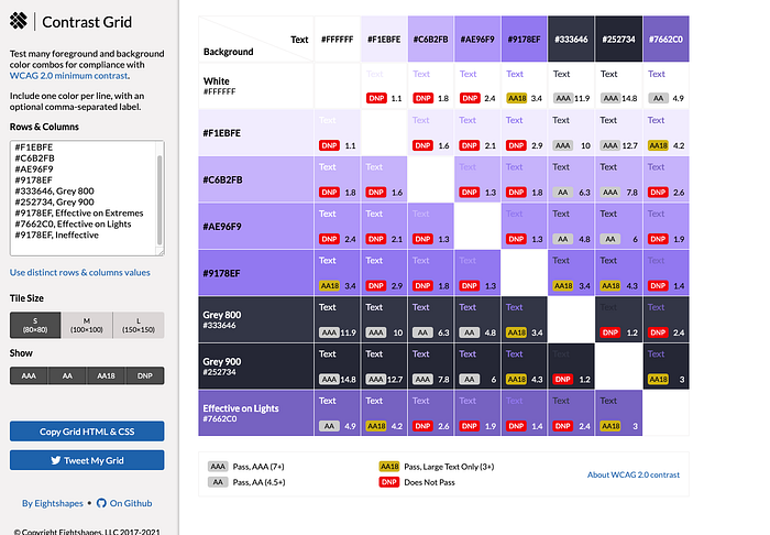
Similarly, tools such as Color.Review tool or the EightShapes Contrast Grid tool came in quite handy when testing different foreground and background colour combinations for compliance with WCAG 2.0 minimum contrast.
Translating these colours into real-world UI components relied on a lot of testing. Addressing challenging components that use colour combinations from the original colour palette, such as alerts and tags, was a starting point. Accessibility and aesthetic concerns were addressed, with certain components requiring creative compromises while retaining accessibility.
3.2 Harmonising industry or context-specific hues
If your design system caters to tools that operate within a broad spectrum of statuses, relying on colour combinations to signify these statuses or severities, you’ll find particular importance in meticulous testing of components and colour pairings. In my case, this was crucial when addressing the challenge of maintaining clear distinction and optimal contrast within vulnerability severity colours.
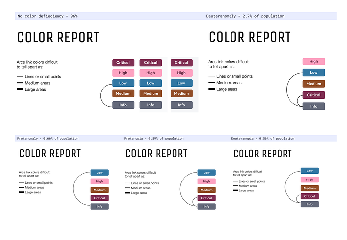
This challenge prompted a collaborative effort involving designers and product managers from various domains. Together, we delved into the nuances of distinguishability, meticulously identifying and assessing potential challenges. Through this process, we deftly navigated the complexities, ingeniously selecting darker tones and refining foreground-background colour pairings. These subtle yet powerful adjustments harmonised the palette, contributing to heightened clarity and a stronger sense of inclusivity in the final design.
4. Addressing future needs
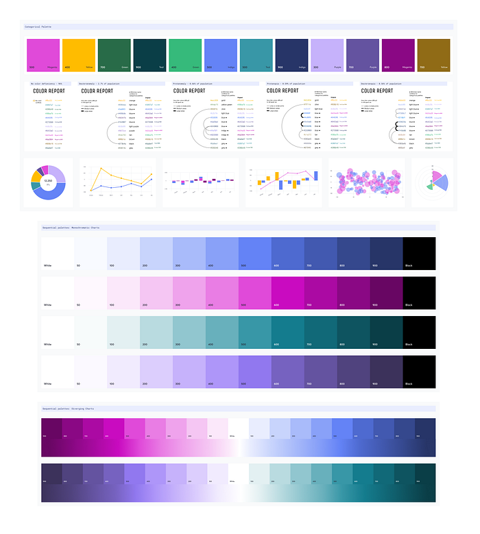
With a robust foundational palette established, the focus then shifted to anticipating future needs. Utilising the aforementioned Wildbit tool, I expanded the palette to accommodate additional tags and data visualisation elements that we knew were necessary in the near and not-so-near future. Further refinement through the use of tools like VizPalette resulted in categorical and sequential palettes that catered harmoniously to diverse requirements and use cases for visualising large sets of data, while still complying with WCAG 2.0 contrast standards.
5. Committing to a new palette
The culmination of this process led to the creation of the Design System’s Colour Palette 2.0.
Contrasted against its predecessor, this palette exudes harmony and cohesion. A unified hue progression enabled seamless integration across design elements. Remaining faithful to brand identity and semantic logic, this palette steadfastly adheres to accessibility standards, accommodating both vertical and horizontal colour sequences.
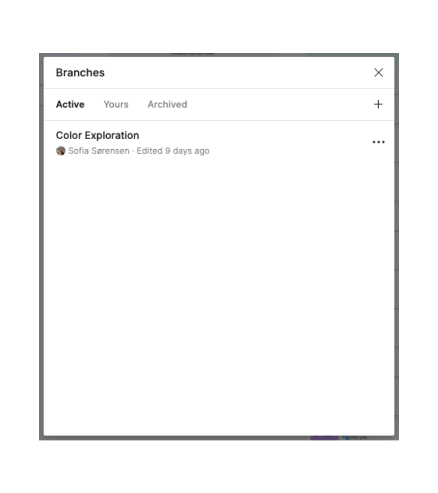
At this point, what is needed is to gather the previously identified stakeholders to have a final critique and validation of the resulting new palette. This step can take some time to get through and a good idea would be to create a branch of your Figma Design System file where you applied the colours for the new palette so that you can show your peers and stakeholders how the colour and shade changes would look like in practice. This makes it easier to receive direct and clear feedback.
It is a good idea to get a sign-off from a wide range of stakeholders, as their input in the design system helps everyone feel like the common design language is built by a community of people rather than by a single individual or team. A sense of ownership makes adherence to design guidelines and colour usage much easier for everyone.
6. Implementation
Once the process of review and critique has finalised, it is time to refine the palette with included feedback and go ahead and implement changes on the design code/components repository and Figma file so that everyone can continue using the design system with the latest adaptations available.
This marks the transformation of your design system’s colour palette into a powerful tool that not only enhances the aesthetic appeal of your product but also promotes inclusivity and accessibility for all users.
Final remarks
In conclusion, embarking on the journey to refine a design system’s colour palette is a multidimensional undertaking that marries creativity with inclusivity. By carefully evaluating the existing palette, leveraging accessible colour tools, harmonising colours with UI elements, and collaborating with stakeholders, we forge a palette that speaks the language of aesthetics and accessibility in unison.
This meticulous process, guided by a commitment to consistency and clarity, culminates in a palette that not only enhances the visual allure of your product but also opens the door to a more inclusive digital landscape. With each hue and shade selected thoughtfully and tested rigorously, we create an environment where every user, regardless of their abilities, can interact with your product effortlessly.
As designers, we wield the power to shape digital experiences that are both beautiful and accessible. Through this journey of transforming a design system’s colour palette, we bridge the gap between aesthetics and usability, ultimately fostering a sense of belonging for all users. So, let’s continue to create with intention, ensuring that every colour choice we make paints a brighter, more inclusive digital future.

